
Only 1 in 10 people who make it to a landing page will become a lead. If you’re all about acquisition, then landing page creation and improvement need to be part of your content marketing strategy. Writing a landing page in 2022? Here’s what performs best and how to maximise your success rate.
What is a Landing Page?
We’re not here to insult your intelligence, so we’ll keep it brief. A landing page is a standalone web page, created specifically for a marketing or advertising campaign. It’s where a visitor ‘lands’ after they click on a link in an email, or ads from Google, Bing, YouTube, Facebook, Instagram, Twitter or similar places on the web.
Landing pages are designed with a specific goal in mind and should have a very clear call-to-action. This is the main thing to keep in mind during landing page creation. While any page can technically be called a ‘landing page’, your conversion goals will become clearer if you think of a landing page as a campaign-specific page with one single focus. This mindset will keep your marketing goals on track and make your campaign a lot easier to understand through analytics.
You might see a lot of variation, but there are two main archetypal landing pages with regards to goals. Lead generation landing pages and clickthrough landing pages. Here’s a summary of each and how you can optimise these pages to your advantage.
Lead Generation Landing Pages
The purpose of this type of landing page is to collect lead data, like the names, job titles and email addresses of visitors, often in exchange for a resource, like a branded e-book. Filling in a form with these details is usually the call-to-action. B2B marketers selling high-ticket items often use this type of landing page to build a list of opted in prospects. Ecommerce brands also uses these pages for list-building or offering free shipping or special deals.
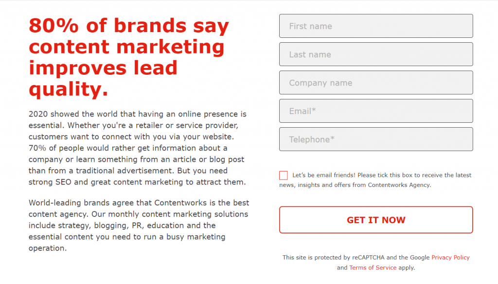
Fun Fact: Landing pages with a sign-up form can achieve a conversion rate of up to 23%. But keep in mind that the best type of landing page sign-up form will only include 3 questions. Take a look at this e-newsletter sign-up page from the National Sewing Circle as an example of a good lead generation page. From a consumer perspective, the form is quick and easy to fill in. From a brand perspective, a new email equals a new lead – and that’s a job well done.
Here are some more tips on how to write a great lead generation landing page.
#1 Make Giving Away Personal Information a No-Brainer
There’s no shortage of companies looking to flaunt their latest offers. This has made consumers wiser to marketing tactics and more discerning about who they give their contact information to. They need more than a blank form field and instead need to clearly see the value of that ‘sign me up’ button. One of the best things you can do is to know your audience and to address consumer concerns. This can actually increase landing page conversions by up to 80%.
Take a look at this case study from Vancouver Island University (VIU). Studies show that students and potential students worry about course funding. So to address this, VIU created a lead generation landing page giving a lucky, full-time student the chance to win $2,500 tuition credit. The copy stated, ‘we’re here to help you’ and the call-to-action was extremely clear.
This entry form also appeared right at the top of the page meaning people didn’t have to scroll below the fold to complete the sign-up process. Remember, getting people to sign-up is the main purpose of this page and therefore should be as easy as possible. With this in mind, you should always remove any unnecessary content fields.
#2 Think About Design and Colour Schemes
When it comes to landing pages, you need to think about the designs you use. In the example above, the form is surrounded by bright graphics and is laid over a photo of fresh-faced students gathered on a beach. This instantly communicates a cheerful, people-centric message that’s inviting and hard to ignore. The white text is eye-catching, and the three white boxes emphasise that the sign-up process is simple. White space is also paramount to a good landing page design, helping to reduce clutter and maintaining the readability of the page.
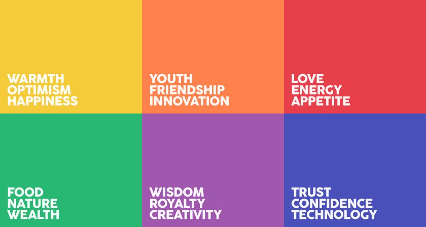
Do your research about colour psychology. Blue, for example, is heavily associated with reliability and trust. It’s considered sincere and non-confrontational while at the same time radiates security and confidence. That’s why so many finance and trading brands make their call-to-action buttons blue. Black, on the other hand, is associated with class and sophistication and is regularly used by designer brands, whereas pink is thought to evoke feelings of excitement and fun and can therefore be used effectively by companies promoting creative products such as video maker tools.
#3 Use Pop-Up Forms Carefully
Pop-ups have long been a source of irritation for consumers. But they’re now being used more effectively by marketers in order to generate leads. Pop-ups today tend to be relevant to the content on the page and usually require people to click out of them in order to return to what they were reading. As consumers are forced to act in some way, such forms can actually convert at a whopping 9.3%. To put this figure into context, the average landing page conversion rate falls around 2.35%. Another study by Unbounce, which analysed lead generation pages across 10 different industries with 74,551,421 total visitors, shows that the average landing conversion rate is 4.02%. While this differs according to industry, it’s clear that pop-ups can have a significant impact.
If you’re going to go down the pop-up route, however, make sure you:
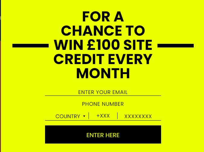
- Offer something relevant and valuable. The chance to win site credit in exchange for an email address, for example, is attractive and aimed at consumers already interested in the product/service. Think carefully about what you’re promoting on your landing page and make sure your form has a suitable incentive.
- Use a time-based pop-up. It’s fair to say that those who have been on your landing page for more than 30-seconds are more interested in what you have to say than those who bounce straight off. So it’s a good idea to have a pop-up come up after a certain time period. Try looking at Google Analytics to see exactly how people engage with your landing page. You can also use tools to create heat maps to get a better sense of where people click and scroll. This will help inform your pop-up form placement decisions.
#4 Highlight Your USPs
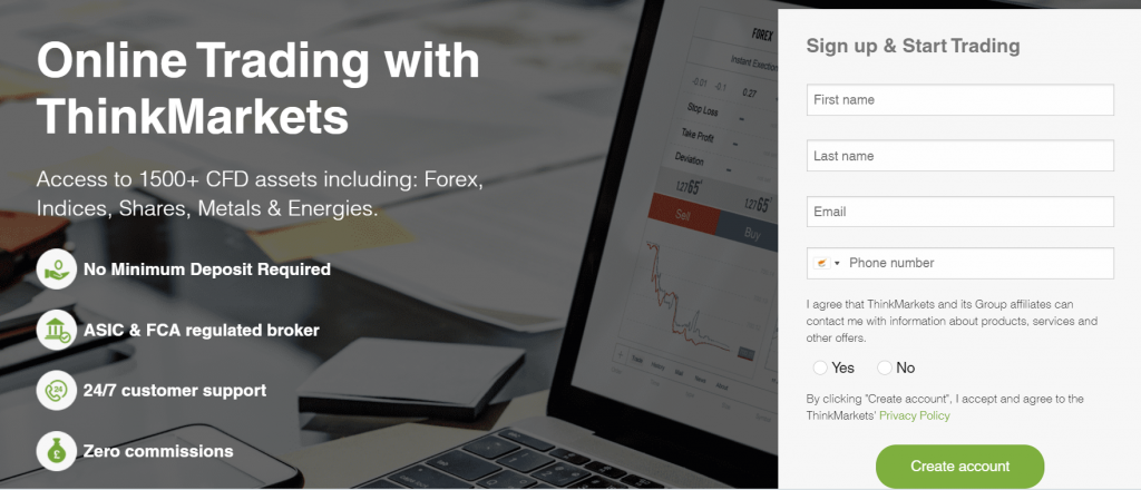
When it comes to lead generation pages, you need to be convincing. If you want people to sign-up, it’s important to tell them why this is a good idea. But you don’t have much time or space to waste. Your content needs to be clear, concise and persuasive. It should also sit alongside the form to prevent people from scrolling away from what you want them to do. Creating bullet pointed or tick lists is a good way to communicate your USPs clearly. Take a look at this example from ThinkMarkets.
#5 Split test to determine the best lead-generation CTA positioning
When generating leads through landing pages it’s important to carry out A/B split-tests to see where you should place your form. Knowing which position works better will help you tweak the design of your landing page in a bid to maximise conversion. As well as the position on the page, a simple tweak of your form field length could also improve conversion. Or you might find that adding drop down boxes makes people more likely to take action.
#6 Use Social Proof
Did you know that landing pages with social proof in the copy convert at an average of 12.5%? That’s pretty impressive. According to a report from Nielsen, 70% of people will trust a review from someone they’ve never even met. Consumers have more access to information than ever before, and they put a lot of stock into what their peers are saying about the brands they use. Most consumers are researching products and services before they even engage with your business. The actions of other people can certainly influence our decision making. So it’s worth including customer testimonials and reviews next to your link generation form. Where possible, it’s also good to include celebrity or influencer endorsements, as well as media mentions. You can also include brand stats such as how many people have already downloaded your e-book or signed up to your delivery service. Don’t write fake testimonials! Instead ask your existing clients to provide real ones.
Clickthrough Landing Pages
A clickthrough landing page is a landing page without a form. A click-through page is often used as the middleman between your ad and ecommerce shopping cart. Its purpose is to warm up visitors to your unique value proposition before sending them deeper into the marketing funnel where the actual conversion will take place. Here’s how to make those all-important clickthrough landing pages work harder.
#1 Include an intriguing headline
The clickthrough landing page allows visitors to read persuasive information about an offer without being distracted by the terrifying ‘buy’ button. To pique their interest, it’s essential to include an intriguing headline that matches with your ad content to avoid a high bounce rate. Remember, the content produce must meet the promises laid out in your ad copy and your keyword focus should be streamlined to suit the purpose of your campaign.
Here are two very different headlines both of which are intriguing. Think about your target audience, your tone of voice, brand style and the product or service you’re promoting. Play with words, puns and trending topics to create a winning headline.
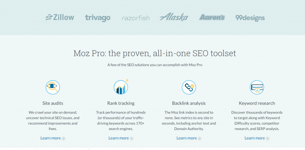
#2 Focus on the Benefits of your Product/Service
If you want people to take a specific action which drives them further along the sales channel such as sign up, start a free trial or subscribe, make sure you focus on the benefits of your product/service. Take a look at this example from all-in-one SEO tool Moz. The headline is positive, and the call-to-action is tempting as it uses the word “FREE”.
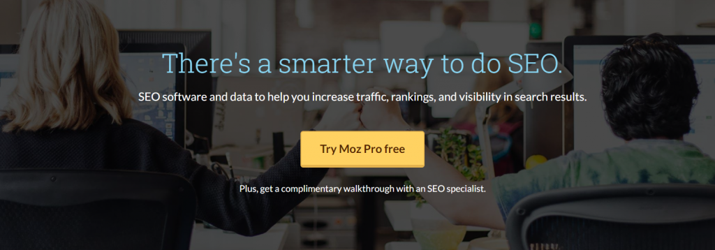
Note the use of social proof and clearly laid out USPs too.
#3 Make Use of Authority Badges and Reviews
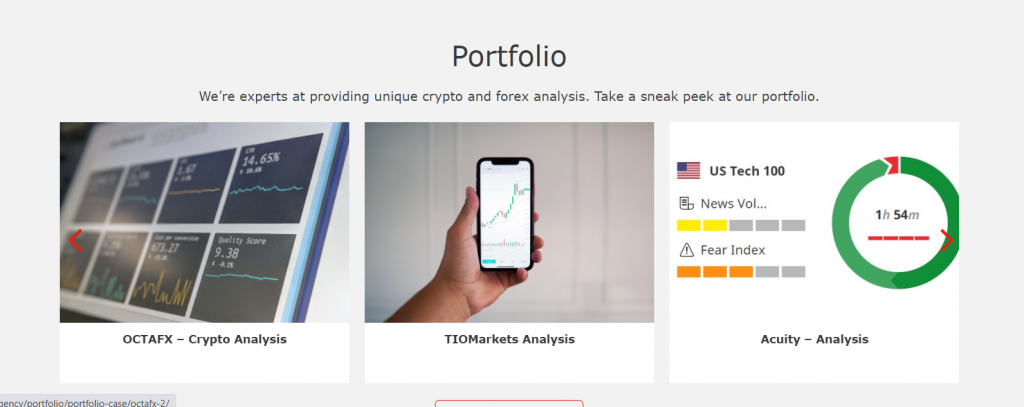
Why should people choose you? This has to be clear on a clickthrough landing page if you want people to take that important next step. Using authority badges is one idea as this instantly associates you with other well-known companies and makes your marketing more credible. You can also benefit from posting a review snippet from people who have used your products and services. Include a picture of the reviewer, their name and who they work for if you want extra marketing points and a gold star. This helps install feelings of trust. A Contentworks Agency, we showcase our portfolio on our landing pages. By showing relevant work samples – eg analysis on a landing page about analysis, you are helping build trust with potential clients.
#4 Be Creative Below the Fold as well as Above
Landing pages can be complex and take time to construct. Yes you need catchy headers and sub-headers as well as call-to-actions placed in hotspots based on research. But you don’t have to just focus on what’s above the fold. There’s plenty of value in producing content that matters to your target audience. For instance, including video in a landing page can increase conversion by 80%. So think about incorporating explainers or how-to videos. You could also compare the products and services you offer side by side in chart form or even add an FAQ series to inform and educate your audience.
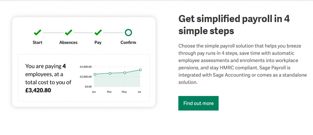
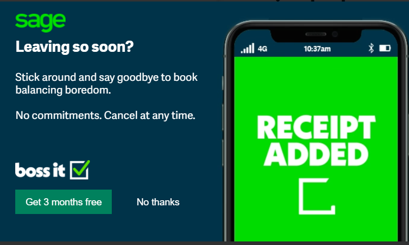
This is a great example by Sage Accounting of how to create a long-form clickthrough landing page, plus a savvy pop up for anyone wanting to leave!
And lastly these important landing page tips
- The first rule of landing pages is one offer per page. In fact, multiple offers can decrease conversions by up to 266 percent!
- Unless it opens a form, leave links off your landing page
- Only 50% of all landing pages are mobile optimised. Mobile use is one of the fastest growing segments of the internet. If your page isn’t optimised for mobile, your prospect is gone in seconds.
- Companies with 40 or more landing pages get 12X more leads than those with five or less. Just be sure to keep track of them, update them regularly and avoid broken links. When emotions like awe and laughter are used, conversion rates can increase. Landing pages should evoke emotion with colour, images, copy, or video.
- Asking for your visitor’s age is usually unnecessary, unless your products have a legal requirement (e.g., alcohol). In fact, asking for unnecessary details like age, job title or address, increases your bounce rate.
- And being misleading will increase your bounce rate too. If the text or image leading to the landing page doesn’t accurately reflect what’s coming, your visitors will leave swiftly. A high bounce rate tells Google that your pages are not relevant or worse, that they don’t contain valuable information.
- 48% of the top landing pages are ranked in maps and organic listings. Be sure to provide us with your keywords and phrases before we create your content.
Here at Contentworks we know the importance of creating landing pages that work hard for your brand. Contact us today for tailored content and a content marketing strategy that works in 2022.